Managing large amounts of student, staff, or timetable data can be overwhelming — especially when the tools you’re using feel clunky or outdated.
Modern education websites and portals need to make it easy to view, update, and interact with information. Whether you’re logging attendance, checking reports, or updating contact details, the experience should feel simple and efficient — even if there’s a lot going on behind the scenes.
Here are 10 smart web features that make working with school or college databases faster, easier, and more intuitive — no tech expertise needed.
1. 📁 Expandable Sections (Accordion Controls)
What it is: Click to expand and reveal more details — without cluttering the screen.
Why it’s useful: Ideal for student records or timetables where you only want to see details when needed. Keeps things tidy.
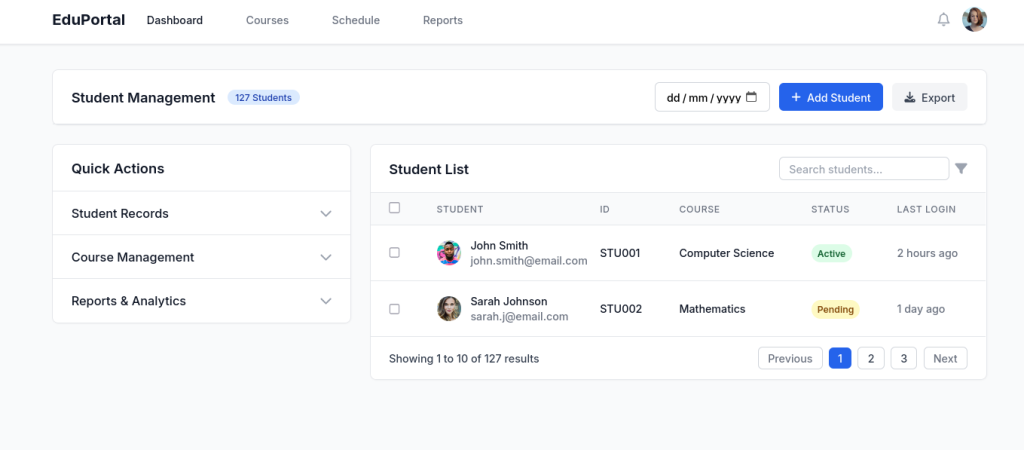
2. 📊 Tables You Can Search, Sort, and Filter
What it is: A dynamic list of data (like pupils or reports) where you can:
-
Search by name or class
-
Sort by grade or attendance
-
View one page at a time
Why it’s useful: Saves time finding what you need — no scrolling through hundreds of rows.
3. 🔍 Smart Search Boxes with Suggestions
What it is: As you type, the system suggests results — like student names, staff members, or topics.
Why it’s useful: Helps you find the right record quickly and avoids mistakes.
4. 🗂️ Tabs for Switching Between Categories
What it is: A neat row of tabs (like “Student Info”, “Contacts”, “Reports”) to switch views.
Why it’s useful: Keeps related information grouped together — no back-and-forth between pages.
5. ✏️ Click-to-Edit Fields
What it is: You can click directly on a name, grade, or note and edit it instantly — no extra forms.
Why it’s useful: Speeds up tasks like correcting spelling or updating marks.
6. 🧩 Forms That Adjust Based on Your Answers
What it is: If you select “Yes” to “Does this student have SEN needs?”, extra boxes appear for more details.
Why it’s useful: Forms stay short and relevant — no confusion.
7. 📅 Easy-to-Use Date Pickers
What it is: A small calendar pops up to choose dates — no need to type anything manually.
Why it’s useful: Great for logging absences, booking meetings, or viewing date ranges.
8. 🪟 Pop-Up Windows for Quick Edits or Previews
What it is: A small window appears on the screen to show or edit information, without changing pages.
Why it’s useful: Lets you make changes or view details quickly without losing your place.
9. 📌 Sticky Headers and Toolbars
What it is: Important buttons (like “Save” or “Filter”) stay visible even when you scroll.
Why it’s useful: You’re never hunting for the button to finish a task — great for long class lists or reports.
10. ✅ Clear Messages and Confirmations
What it is: Little messages that appear when something has saved, failed, or needs attention.
Why it’s useful: Gives you peace of mind — you know what happened and what to do next.
🎓 In Summary: Make Your Systems Work for You
You don’t need to be technical to use modern systems effectively — but you do need tools that are thoughtfully designed for busy staff and leaders. These are 10 features that help reduce errors, save time, and create a calmer, more confident user experience across your organisation.
🚀 Need help designing your department’s digital platform?
At Terrabase, we specialise in building clean, reliable systems for universities, colleges and educational organisations — including:
-
Staff & pupil portals
-
Attendance systems
-
Curriculum databases
-
Online homework tools
Let’s create something that works the way you work.
This really cleared things up for me.